The importance of standing out: Why you shouldn’t take the safe path when marketing your movie

The competition and challenges of film launches are only set to become more difficult over the coming years. We embarked on analysing the status quo and breaking down what steps distributors, filmmakers, producers and entertainment content producers in general can take to cut through the noise in trying to bring their content in front of the relevant audiences.
The final result is Winning Your Audiences. Movie Marketing in the Connected World - an ebook filled with case studies and actionable insights driven from our activity at Gruvi. Over the next weeks we will publish excerpts from the book here. The entire e-book is available to download for free on our website:

Scot Bendall, creative director at La Boca in West London, says the consortia of companies and other backers that provide financing for films can be risk averse. This comes through in the marketing, which seems to “go in a safe direction”, as he puts it. “Once a film grosses well with a particular style of poster, you are likely to see that style replicated over the genre as it was deemed a successful design.”
Do your images, movie posters or trailers convey meaning?
Netflix calculated that the average human spends 1.8 seconds reviewing each poster thumbnail before making a decision for each move on or click. By that logic, that means you have 1.8 seconds to engage your audiences with your movie’s EPK and poster. That’s not a lot of time. So what do you have to do in order to succeed?
Complex Emotions
As I mentioned previously, we are hardwired to respond to faces, particularly when they display complex emotions. In Netflix’s own research, they found complex emotions actually compel people to watch a story more. This is because complex emotions convey a wealth of information regarding the tone or feel of the content. Conveying emotion through faces and editing (by association) goes back to the beginnings on cinema and Kuleshov’s experiment (to revisit the Kuleshov effect, you can watch a video of Alfred Hitchcock explaining and demonstrating the principles behind it.
Sometimes images convey a strong compelling narrative of their own — here are some examples from recent campaigns we worked on. Bear in mind that in relation to normal click through rates in the ad industry, anything over 1% is treated as very good.
Toni Erdman
Engagement Highlight: 13.52% click through rate

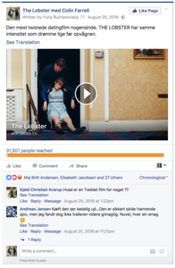
The Lobster
Engagement Highlight: 9.68% click through rate

The Man Who Saved The World
Engagement Highlight: 6.89% click through rate

800 Shares 2000 + likes 92 Comments
Less Is More
In trying to convey meaning through creative, a good rule of thumb online is to focus on a few details.
In the following case, for HBO, we found that this image had a low click through rate, compared to the individual images we selected for other campaigns.
Engagement: Click through rate 0.63%

We found out, with examples such as this, that while ensemble casts are fantastic for a huge billboard on the side of a highway, they are too complex at small sizes and ultimately, not as effective.
Star Power
We have seen star power work well when we use visible, recognizable characters (and especially polarizing ones). It’s also natural for us to respond to villainous characters. This goes back to our pre historical fascination with myths — the ancient stories and our being enthralled by the antagonist figures of the Gorgon, the Dragon, the Snake, etc. We all find the villains fascinating because our subconscious, over millions of years of evolution, is attuned to detect and warily investigate unknown threats.
The Meaning Of Your Messaging
Messaging is important too, but it’s worth noting that it is secondary to the power of an image. Keep in mind that conveying meaning through advertising online is usually done 85% of the time through the image and 15% through the text. That being said, a good opening or headline copy is important.
We ran some tests on creative and messaging for the film Force Majeure (2014, directed by Ruben Östlund) before we initiated the wider media spend. The following are two examples that clearly demonstrate the power of creative and message adjustment along with a refinement in targeting.

Results from Advert 1 were disappointing. For a total of £19.22 clicks were generated, mostly on mobile devices, at a cost per click of £0.75. Actions within the player were:
• 8% clicked on showtimes
• 69% of those watched the trailer
• 0% exited to buy tickets
Not very healthy numbers!
We liked the strap line ‘In an avalanche, would you save your iPhone or your family?’. We felt this was quite eye catching but we decided to translate it to Danish (despite the average Dane’s impeccable English, we thought this could help). We then narrowed the targeted interests to areas where we 59 felt a statement like this, with the right image, would have better affinity. We narrowed in on: Snowboard, Cross-country skiing, Ski, Lars von Trier, Skiing, Alpine skiing or Snowboarding. We updated the copy, swapped the image for a more startling, attention grabbing image of the family fleeing the avalanche, and added a paragraph about the movie.

Results for Advert 2 were much better. For a total of £40–260 clicks were generated, mostly on mobile devices, at a cost per click of £0.15. Actions within the player were:
• 199 people viewed the player
• 33% clicked on showtimes
• 18% watched the trailer
• 8% exited to buy tickets
You do have to be careful though — wrongly classifying or misrepresenting your content, whether intentionally or not, is not a good idea. Our next case study will focus on our work for It Follows and will show how starting with the wrong hypothesis can be damaging and how incorrectly assuming a target audience's age range can lead to criticism.

